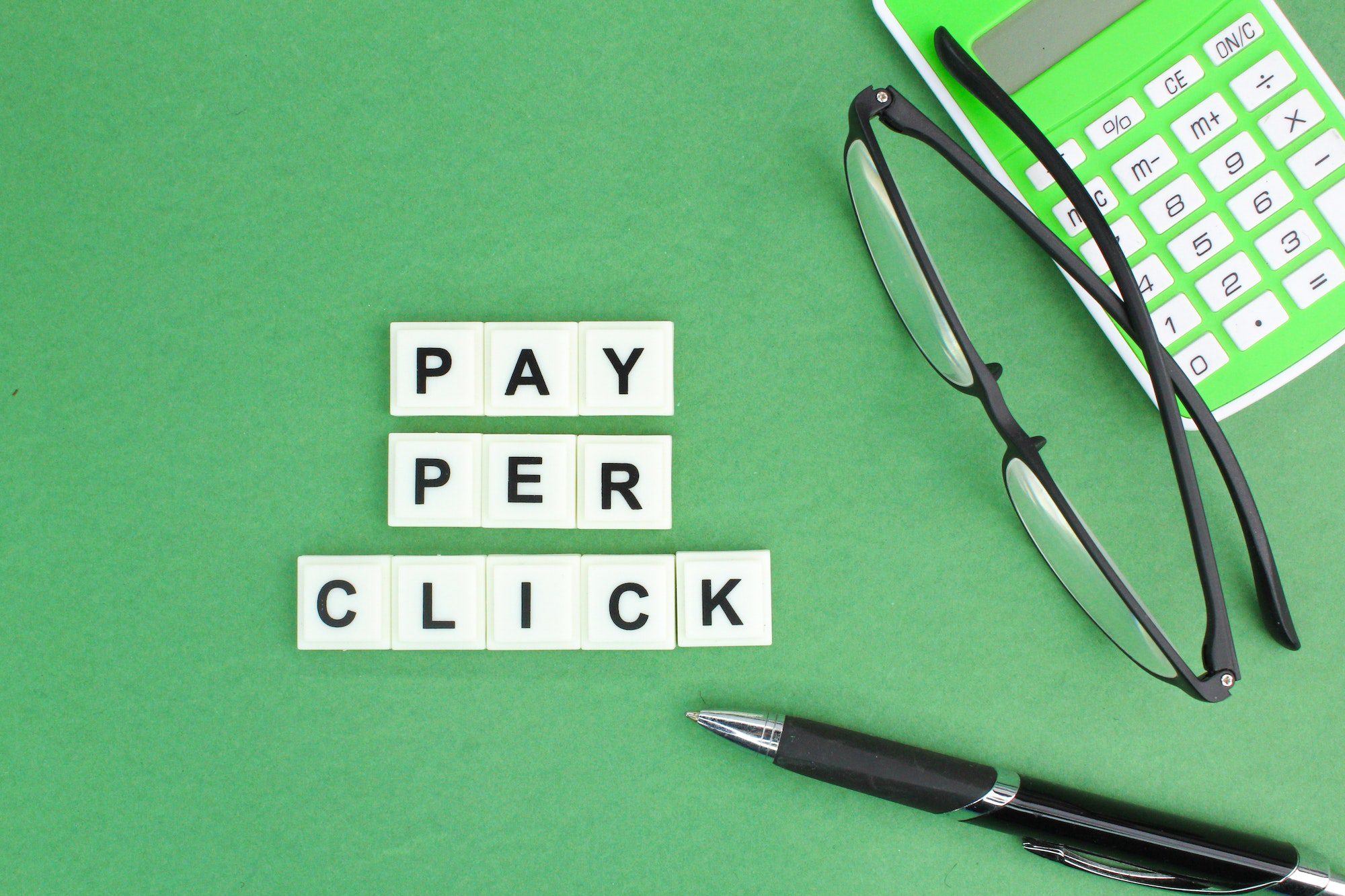
So you may be spending money on sending paid traffic to your website or maybe you’re just starting to think about that as a possibility. But here’s what I’ve seen happen a million times right.
You look in your Facebook ads dashboard or for your google ads, and what do you see lots of people clicking over to your site, but nobody’s converting on your site they’re not buying your products, they’re opting in for your lead, magnet, in other words, you’re paying to send people into a leaky bucket, rather than an airtight customer trap, losing lots of money in the process. So today I’m gonna help you fix those leaks so way more of the traffic that you’re paying good money for can feel good about taking that next step with you and stick around till the end. At the end I’m going to share a bonus add-on that can really help you hit that next level.
So these are all the things I’ve been implementing on client websites over the past decade that have been responsible for hundreds of thousands of dollars in extra revenue. So if you take care of these things, you’re gonna be amazed at how profitable your ads can suddenly become. All right, let’s get right into it, so first things: first, we need to talk about where you’re sending people to in the first place.
1. Directory
So when you create a Facebook, Instagram, Google or YouTube ad, you need to choose the specific page that the ad leads to and in very few cases would this ever be your home page right. Home pages are just Way too general, and when it comes to paid social advertising, you always want to advertise a really specific offer. This can be something free like an introductory service or even a lead magnet or it could be a discount or a value add offer, because we know it doesn’t work so well, it’s just a hey.
For example, we’re a car wash company. So offers are a much smarter play here and when you have an offer you need a page all about that offer. So what exactly needs to go on that page? First, let’s talk about the visual design here.
So, specifically, your offer page or landing page needs to feel visually similar to your ad itself. Now this doesn’t matter so much for a plain text: google ads of course, But when we’re talking about facebook or instagram ads, I want you to think about the image and the colors you’re using on the ad itself, then, when they click through to your page, does It feel like it belongs to the ad that they clicked mimicking the same color scheme, fonts and overall image style. It doesn’t necessarily have to be the exact same image on the ad and in the header of your web page, but they should feel like they’re part of the same overall family right.
You wouldn’t want to use a cartoony image on your ad and then have a very upscale looking photograph on the page itself, because again, people will just think something went wrong because it’s just a huge disconnect and they’re going to react to that very quickly and hit that back button and guess what you just paid for that click. Okay, next, you want to include some kind of an emotional buy-in. So every good salesperson knows that 95% of buying decisions are made based on emotion, and only after that do they use logic to justify the decision they’ve already made, so by taking just the facts approach to your sales copy you’re not really connecting where it counts.
This doesn’t mean I’m not telling you to be emotional, manipulative or overly sentimental. What you just want to hit on is what your products or service could mean to them to either change their life for the better Or get them out of a problem. They’ve been experiencing so if you’re a limo company, you could talk about all the makes and models and how much time you get or you could talk about creating a memory or arriving at your big event in style. Lead with those intangible benefits and then follow them up with the list of inclusions or features, so they can back up and feel even better logically about that very emotional decision.
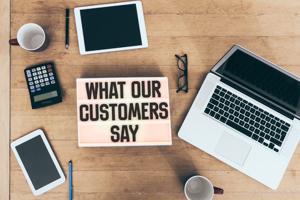
2. Social Proof/Testimonials
Okay, so this next one’s super important when it comes to convincing prospects to take the next step and that’s some kind of social proof like testimonials so when’s the last time you chose a service provider or bought something at a restaurant, Without seeing any reviews first. Well, the same thing applies for your site too, and yes, you do need to put them right there on your offer page not on their own page, because it’s important to treat these offer landing pages as standalones right.
So people don’t need to wander off too far. On their own, I usually like to see around three to five testimonials on a page like this And make sure you’re choosing good ones that actually speak to a common objection that your customers have and then what you need to do is cut them down. As short as possible, I always see people using these really long novel size testimonials that no one’s ever gonna read so make them short, punchy and impactful and try to use your customers’ photos with their testimonials. If they give you permission too, it really helps them, connect much more powerful that way and don’t forget to add five star emojis too it just helps, sell it as that five-star review that it is.
So you’ve got this great offer you’re advertising, but are you making it obvious enough on your site, how your prospects can say yes and take Action. So what you need to do here is have a big, bold call to action button. So, first of all give it a color that stands out from every other element on your page, if your logo is blue, don’t mimic that blue in your button. This is honestly the biggest piece of advice I give that people always ignore, but your button really needs to look like the obvious next step and the way you do that is differentiated visually. So you also want to think about the text that you’re going to use on your button.
It should be incredibly direct, something like get my free checklist. If it’s your lead, magnet or book your consultation, don’t be vague or non-committal with something like contact us or get started. The text on the button should say exactly what happens next and don’t be afraid to repeat that button in multiple locations and in multiple sections on the page, of course, keeping the same color and exact same text each and every time you use it.
3. Page Load Time
Okay, so everything I’ve talked about up to now involves elements that help entice a conversion, But none of it’s going to do any good if people never see it right and the single biggest reason why people wouldn’t see your offer page is, if it loads too slowly and people give up on it. Here’s a fact: the average person will wait no longer than three seconds for a web page to load, and that can be a real problem, especially on mobile. So you definitely want to run your pages through a page speed tool like gt, metrics or google page speed insights to see what you can do to speed things up as much as possible. I will warn you though, those suggestions can get pretty technical and you might need to go to upwork.com and hire a developer to spend a few hours just working through the recommendations on that list.

4. Videos
I promised you a bonus tip, that’s going to help you do even better, and that is using video on your offer page. The reason it works so well is just what you can show using video.
You can’t really replicate in any other format. So if you’re trying to get people to opt in for your lead magnet, just imagine being on camera, telling them the three reasons they would want to sign up or if it’s a product, you could physically show how it works or you could have a testimonial compilation. Cycling through all your happiest customers or clients talking about their amazing experience. Video is incredibly versatile and there’s always a way to use it, no matter what you’re offering so get creative.
I hope this was helpful, if it was let us know which tip helped you the most. Don’t forget to subscribe for more blog posts.