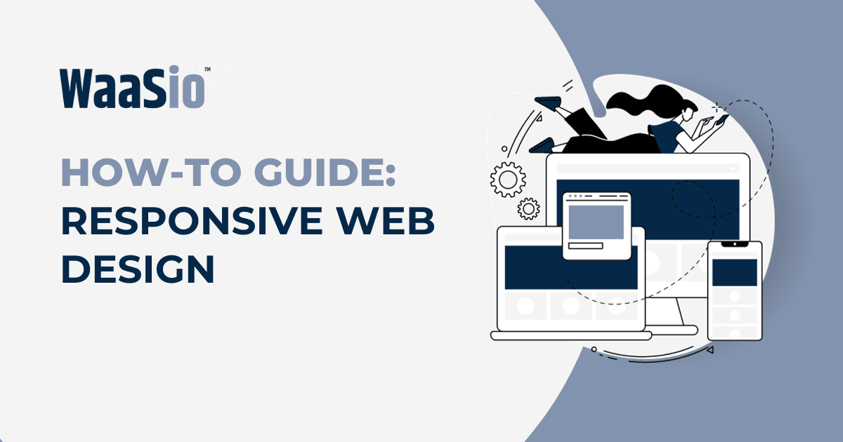
Welcome to the exciting world of responsive designs with Elementor Pro! This powerful tool will revolutionize how you approach web design, allowing you to create stunning, responsive websites that adapt to any screen size. Being proficient in Elementor Pro opens up a new realm of possibilities for your web design skills.
- Responsive Design: The concept of designing a website to respond and adapt to the screen size it’s viewed on is known as responsive design.
- Elementor Pro: A top-tier WordPress builder plugin that facilitates easy, drag and drop web design.
Embarking on this journey means unlocking the potential to deliver premium, professional websites that exude a high level of craftsmanship and user experience. Here’s what we’ll cover in the coming sections:
- The Importance of Creating Responsive Designs with Elementor Pro
- Navigating the Basics of Elementor Pro For Responsive Designs
- Advanced Techniques for Creating Stunning Responsive Designs with Elementor Pro
- Tips and Tricks to Maximize Your Use of Elementor Pro for Responsive Designs
Whether you’re a seasoned web designer or a novice looking to expand your skills, this guide is structured to provide practical, step-by-step instructions to aid in your mastery of Elementor Pro for creating responsive designs. Let’s dive in!

The Importance of Creating Responsive Designs with Elementor Pro
In today’s digital era, creating responsive designs with Elementor Pro is not just an option, but a necessity. The ever-growing usage of mobile devices necessitates websites that can adjust to different screen sizes and orientations.
Unmatched User Experience
- Seamless Navigation: Responsive designs ensure that all users, regardless of their device type, enjoy effortless navigation on your website.
- Improved Readability: Content automatically resizes and repositions itself to fit the viewer’s device screen, enhancing readability.
- Increased Engagement: Responsive designs lead to higher user engagement due to their intuitive user interface (UI) and user experience (UX).
Boosted SEO Rankings
- Google Preference: Responsive designs are preferred by Google, influencing higher search engine result page (SERP) rankings.
- Reduced Bounce Rate: A responsive design reduces bounce rates because it improves user satisfaction and experience.
Cost-Effective & Time-Saving
- One Design, All Devices: You only need to create one design that automatically adjusts to all devices, saving both time and money.
- Easy Updates: Changes or updates only need to be made once, not for every possible device.
With Elementor Pro, you can easily create effective responsive designs without writing a single line of code. Now that we understand the importance of responsive designs, let’s delve into the basics of using Elementor Pro to create them in the next section.
Navigating the Basics of Elementor Pro For Responsive Designs
Understanding the basics of Elementor Pro is key in creating responsive designs. Selecting the right widgets, ensuring mobile compatibility, and utilizing proper structure and spacing are vital. Let’s go through these essential points:
- Widget Selection: Elementor Pro offers a variety of widgets that can be used to create diverse and dynamic content. Choose widgets that allow for responsiveness, such as Image Box, Text Editor, and Button.
- Mobile Compatibility: Ensure your design looks good on all devices. Use the responsive mode in Elementor Pro to adjust settings for different screen sizes. Always test your design on multiple devices.
- Structure and Spacing: Proper structure and spacing ensure a seamless user experience across all devices. Elementor Pro’s section and column structure provides flexibility in design, while avoiding crowded or overlapping elements.
To help you gain a better understanding, we’ll go deeper into each point.
Widget Selection for Responsive Design
In Elementor Pro, there are widgets suitable for any type of content you want to include in your responsive design. Remember to choose those offering customization options for different device types.
Ensuring Mobile Compatibility
Elementor Pro allows you to preview your design on different devices. Make sure to use this feature to ensure that your website is properly displayed on various screens and interfaces.
Focusing on Structure and Spacing
Create a balanced layout with Elementor Pro’s powerful design features. Use sections and columns to manage the structure of your page effectively. Don’t forget about spacing; it plays an important role in readable and visually appealing designs.
Mastering these basics will lay a strong foundation for your journey towards creating responsive designs with Elementor Pro. On this foundation, we’ll build more advanced techniques in the next section.
Advanced Techniques for Creating Stunning Responsive Designs with Elementor Pro
In this section, we delve into more sophisticated methods for using Elementor Pro in your pursuit of stunning responsive designs. These advanced techniques will unveil how to further manipulate Elementor features for optimal responsiveness on various devices.
Employing Custom Breakpoints
Mastering the use of custom breakpoints is quintessential in designing responsive websites. Elementor Pro enables you to:
- Set unique breakpoints for different devices – providing an unmatched tailored user experience.
- Adjust the default breakpoints – giving you the choice to alter the standard tablet and mobile widths to your preference.
Utilizing Percentage-Based Layouts
Percentage-based layouts provide fluidity, ensuring that your design adapts to any screen size. Elementor Pro facilitates:
- Width adjustment percentage-wise instead of pixel-wise – improving adaptability on multiple screens.
- Height settings based on viewport percentages – guaranteeing correct proportions regardless of device specifications.
Leveraging Responsive Column Widths
In Elementor Pro, responsive column widths provide you the flexibility of column resizing according to the device’s width. You can:
- Customize widths for individual columns – allowing for a well-proportioned layout on every screen.
- Make adjustments in real-time and observe the changes simultaneously – promoting efficient designing.
With these advanced techniques at your fingertips, you’re well-equipped to create visually striking, adaptable web designs. The next section will guide you through tips and tricks that maximize your use of Elementor Pro for responsive designs, thus ensuring the optimal application of these advanced techniques.
Tips and Tricks to Maximize Your Use of Elementor Pro for Responsive Designs
Maximizing your use of Elementor Pro for creating responsive designs depends on a number of effective strategies. Let’s delve into a few tips and tricks that will revamp your web design process:
Embrace Mobile Editing
In Elementor Pro, you have the freedom to make adjustments for mobile views separately. This ensures your design is fully responsive across all types of devices.
- Utilize Column Width Responsiveness: Instead of setting fixed column widths, opt for percentages. This way, your columns will adjust according to the screen size.
- Employ Responsive Content Controls: Elementor Pro allows you to hide or reveal sections or widgets based on the device being used by your users.
Master the Use of Spacing Elements
Spacing plays a crucial role in ensuring your designs are responsive. It provides cleanliness and readability across different platform sizes.
- Margin and Padding: Use the sliders to adjust the margin and padding around your content, making it breathe and adapt better to various screen sizes.
- Vertical Align: This is perfect for aligning your content in the center, especially when designing for mobile view.
Optimize Images for Better Response
Images are an essential part of your design. Ensuring they are optimally responsive can enhance user experience.
- Set Image Sizes: Define the size of your images to prevent them from overflowing or being too small on different screens.
- Use SVG Files: These are infinitely scalable and do not lose quality when resized, making them perfect for responsive design.
Applying these tips and tricks will surely level up your skills, making you a pro at creating stunning, responsive designs with Elementor Pro. Stay with us as we conclude by taking your web design skills to new heights in the next section.

Conclusion
In conclusion, using responsive designs in Elementor Pro is an essential skill for anyone looking to enhance their web design abilities. It allows for a more dynamic and interactive user experience, which can dramatically improve the overall aesthetic and functionality of your website.
Key Takeaways:
- Importance: The ability to create responsive designs with Elementor Pro not only improves your web design skills but also enhances user interaction on your website.
- Basics and Advanced Techniques: From understanding the basics to mastering advanced techniques, Elementor Pro provides all the necessary tools for creating stunning responsive designs.
- Tips & Tricks: Maximizing the use of Elementor Pro involves leveraging its unique features, experimenting, and continuous learning.
By implementing these techniques, you’ve taken a substantial step forward in your web design journey. With responsive designs at your fingertips through Elementor Pro, you can confidently tackle more complex projects, ensuring that your website always looks its best, regardless of the device it’s viewed on.
This isn’t the end though; remember, web design is a constantly evolving field. As you continue to develop your skills, there will be new trends, techniques, and tools to learn about and explore.
So, stay inquisitive, keep experimenting, and never stop learning. Here’s to reaching new heights in your web design journey with responsive designs and Elementor Pro!
Let’s move forward on this journey. In the next section, we’ll delve into how to maintain and improve your skills over time, focusing on continuous learning and improvement as key aspects of your web design career.