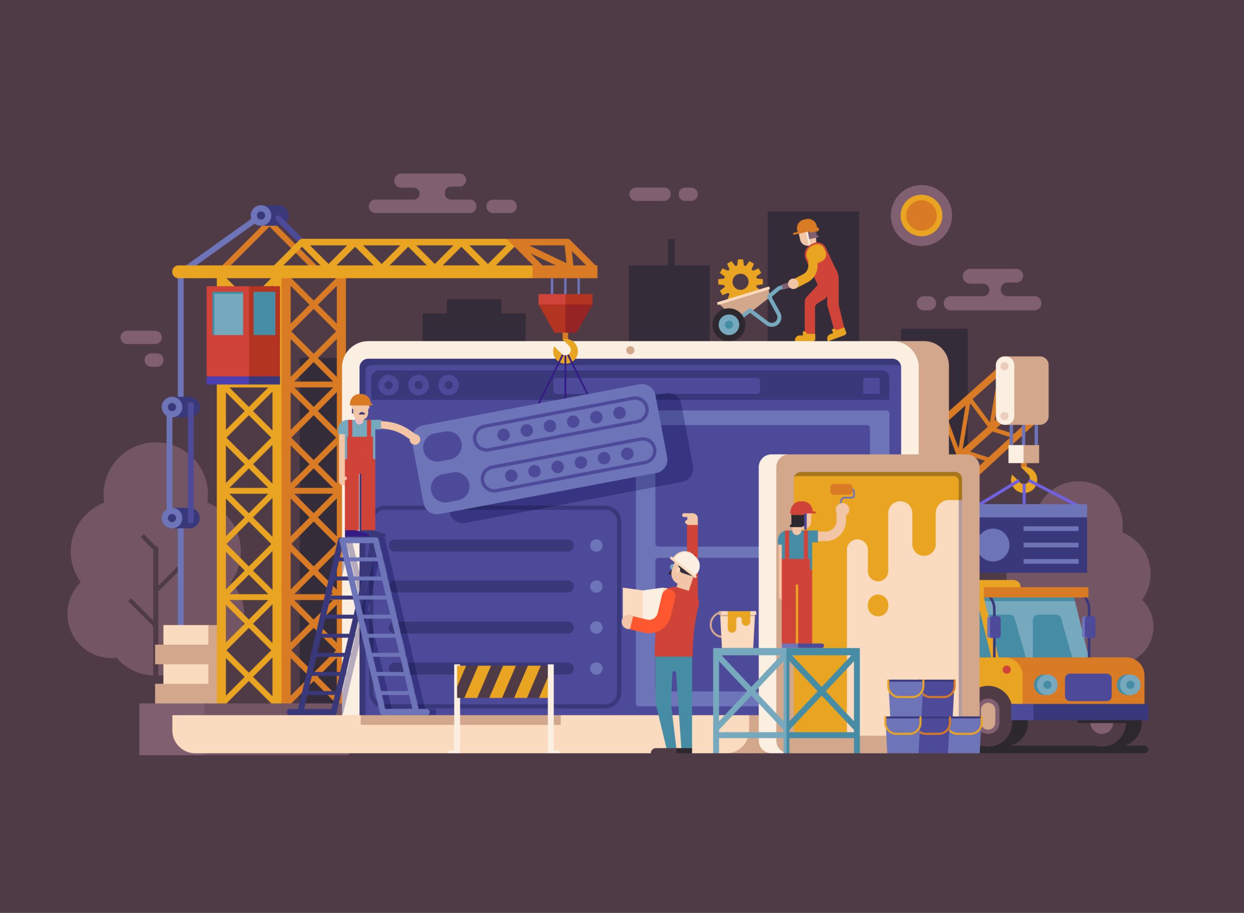
So the content is well written, you have appropriately modified it to be customer-focused and have implemented the 4 steps to improve digital marketing (if you haven’t we suggest you go back and read that first. The design should be secondary to your content). So what now? Well, now you have to display your information in a manner that can actually help you sell it. After all, you can have the most convincing message in the world, but if it is not designed correctly, then your site will likely be destined to mediocrity.
There are several aspects to successful design, and this actually changes quite frequently. The best way to tell what is new in the design world is to check out modern and popular websites. Especially high dollar marketing websites. Hubspot, MOZ, and high dollar advertisement landing pages are good places to start.
There are several key characteristics of modern website design today.
5 Key Characteristics Of A Modern Website
1. Readability: This is more focused on customer readability than search engine readability, but the first thing you should know about readability is the fact that Google and other search engines cannot read inside images or videos. So your content has to be typed out for it to see it, so do not stick wording inside of either of those.
Outside of that, you want to make sure that your layout is consistent with the type of content you are providing. If you are writing an article for your website, then you want to make sure that the width is not too wide for those types of pages. It should be easy to scan back and forth on the page to keep your place.
Also, try and refrain from long paragraphs with too many sentences. Break up content with images, tables, and other things, which I go into more detail in number 4.
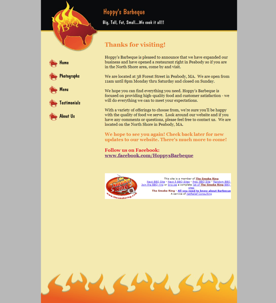
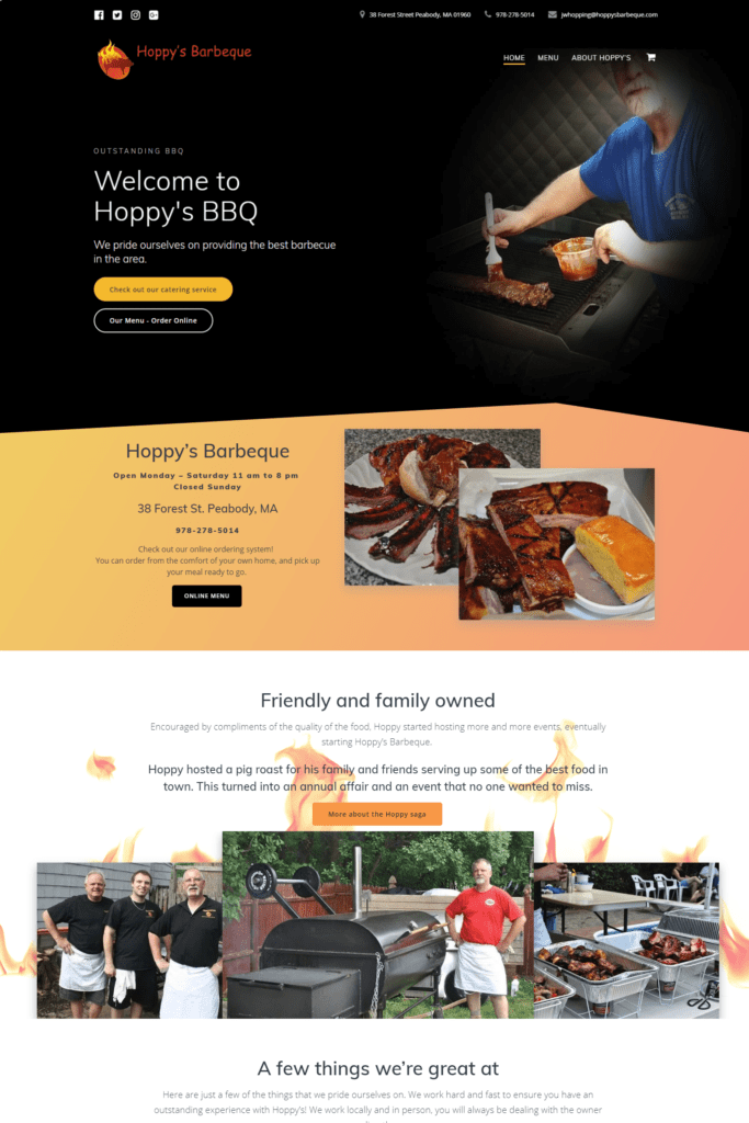
2. Full width: Exactly as it sounds, this is a full-width layout, with sections that are split on the top and bottom, and not consistently down one side, like with the old sidebars. Nothing says “outdated” site like a sidebar. Unless, of course, there is a reason for it, like on a blog post. 😉

3. White space: Previously website designers would shove as much content in as little of a space as possible. this was VERY wrong. It makes a site look cluttered and overwhelming. Using white space between sections is a good way to give the user a mental break between pieces of information.

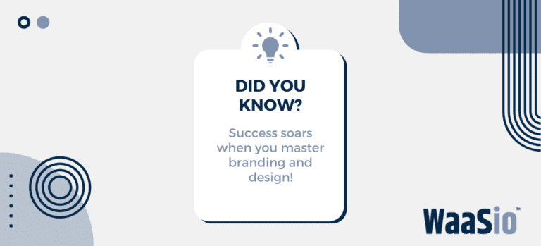
4. Little bursts with graphics: This goes along with number 3. Give little bursts of information with an image, icon, graph, table, or some other illustration to break up the content and give a visual representation of what you are talking about, even if it is subtle. Study after study shows that this is far more effective than a long paragraph.
There is one more thing, make sure your site is truly mobile-friendly. At least 50% of your traffic will be on some sort of mobile device, and it must work for them as well. So make sure your site keeps up with the trends in design, as well as the trends in devices, whether that be larger and larger handhelds, projection devices, VR, or watches, keep it up to date.
5. Parallax: This is when an object or background moves differently than typically expected, like the background remaining in place while you scroll down, or changing position when a mouse rolls over it. These effects indicate a modern and responsive site. It’s not just really cool, it indicates quality, being modern, and in touch with the newest trends.